Knight Frank Partners in Property
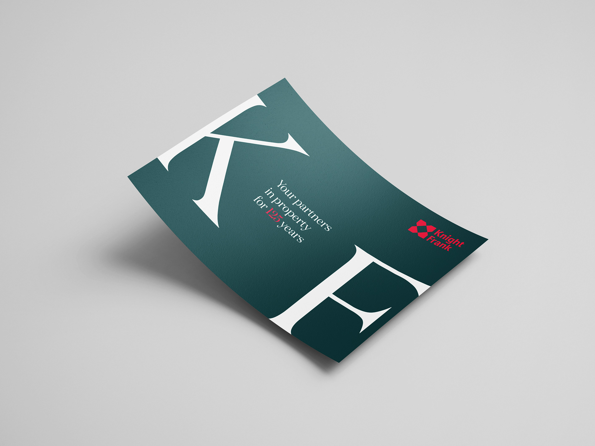
Helping Knight Frank to launch a new brand identity across their UK residential marketing, I developed a new brand look that incorporates typographical design elements within their existing brand colours and fonts. In the new suite of assets, capital letters, beautiful clean typography and a unified colour palette become the centre point. Rolled out across social, digital, email and DM, the assets are a cohesive suite that has enabled the Knight Frank team to have a consistent look and feel across all channels. I have also provided the local teams with a suite of templates they can deploy with ease,
Art Direction | Design | Animation

A set of digital banners and email templates were created featuring the new typographical look and feel.
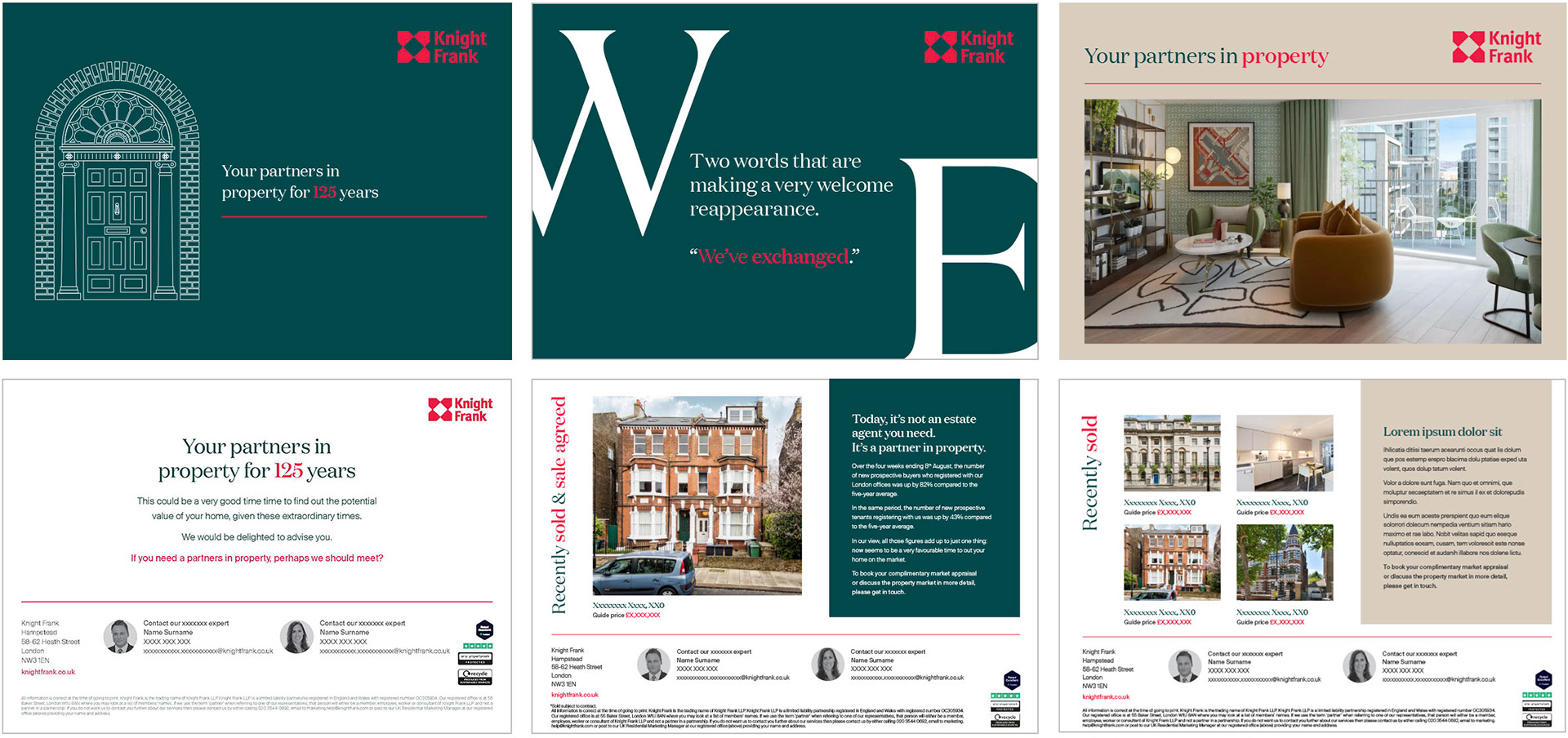
A consistent brand and secondary colour palette was used to create DM assets and in-branch ads.
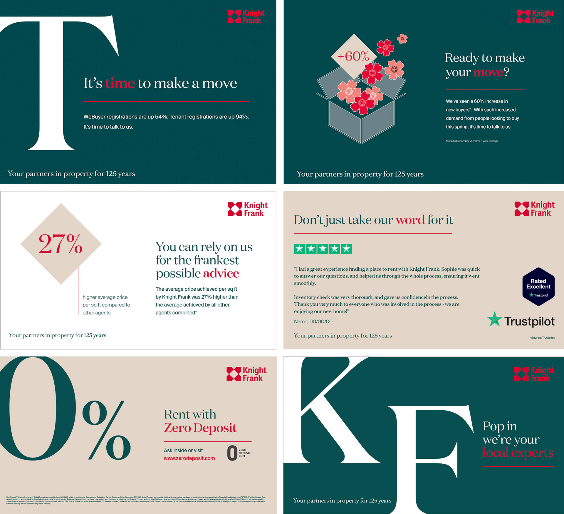

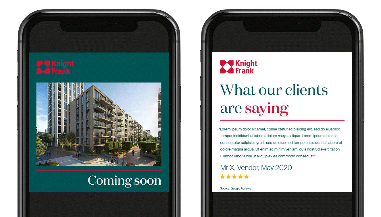
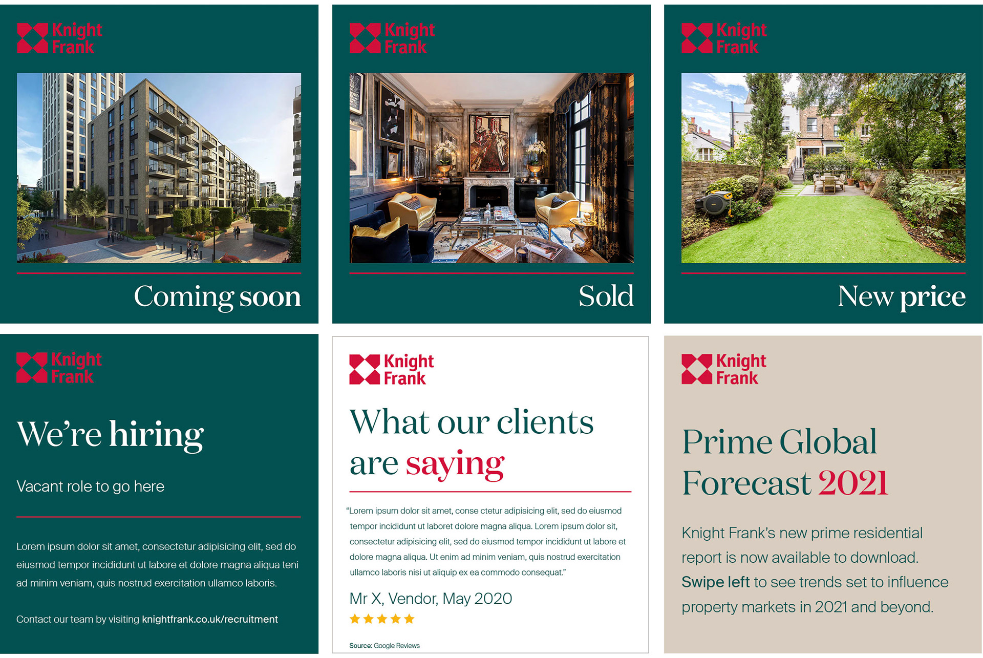
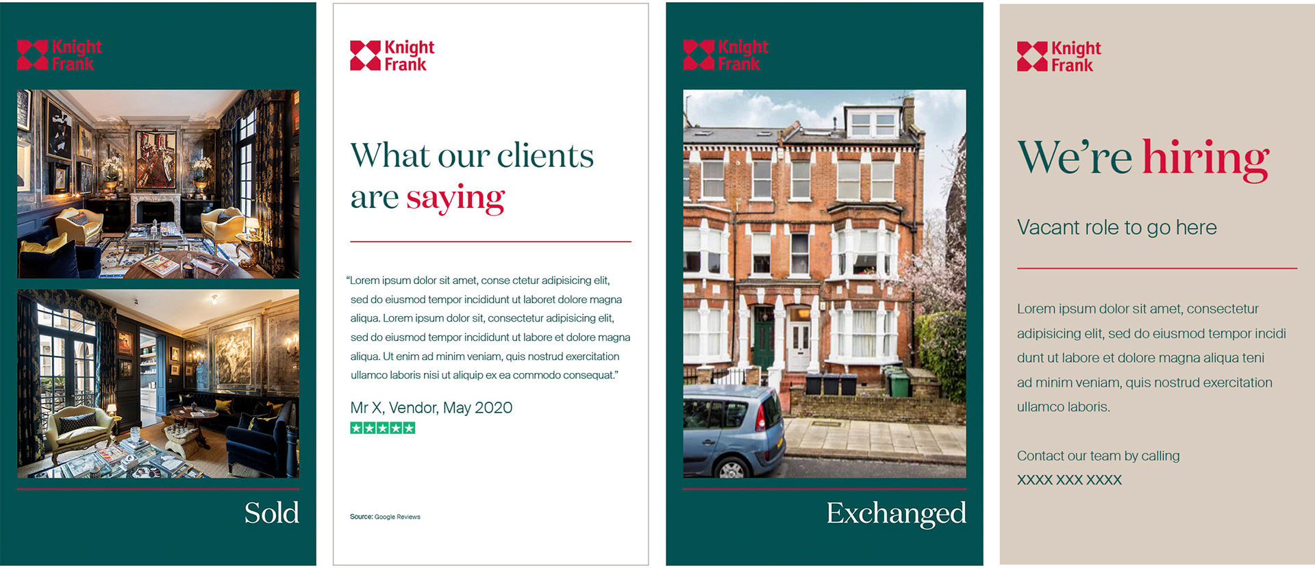
A suite of social assets was created to be used by Knight Frank in-house department to announce latest property news and stats.
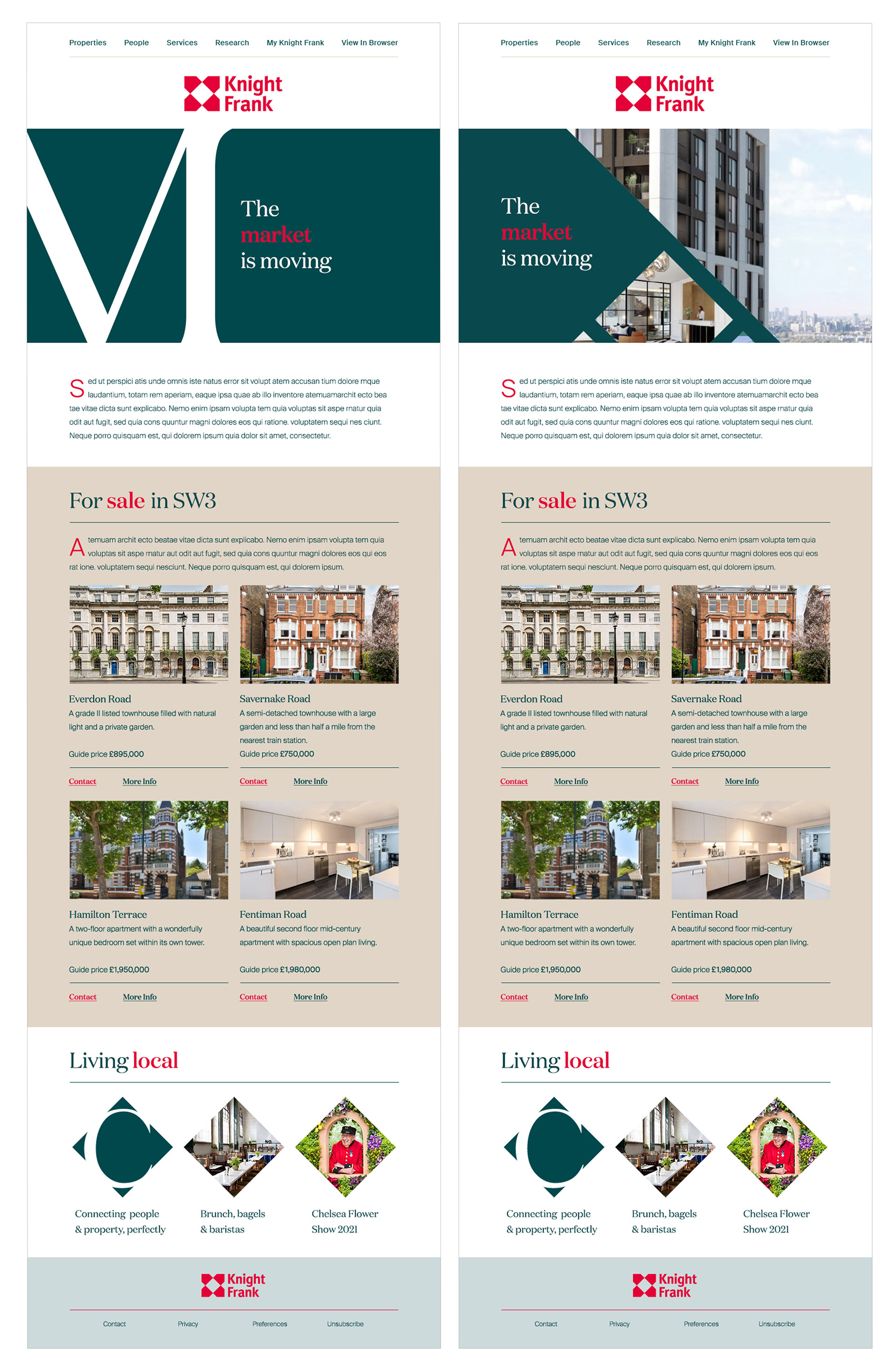
A suite of email templates was created aimed at potential property investors.
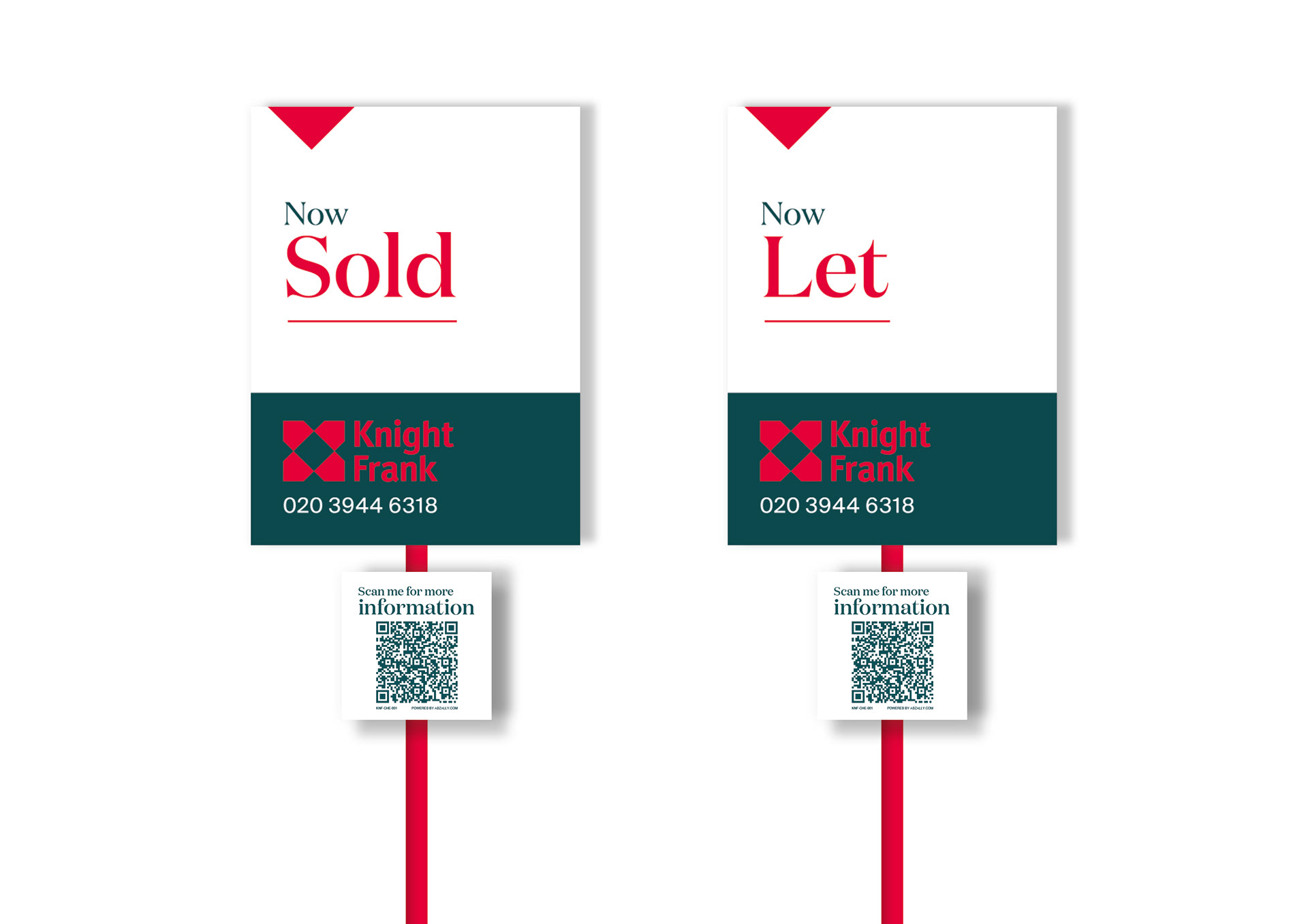
A new system for property signs was created featuring QR codes in order to simplify information access.
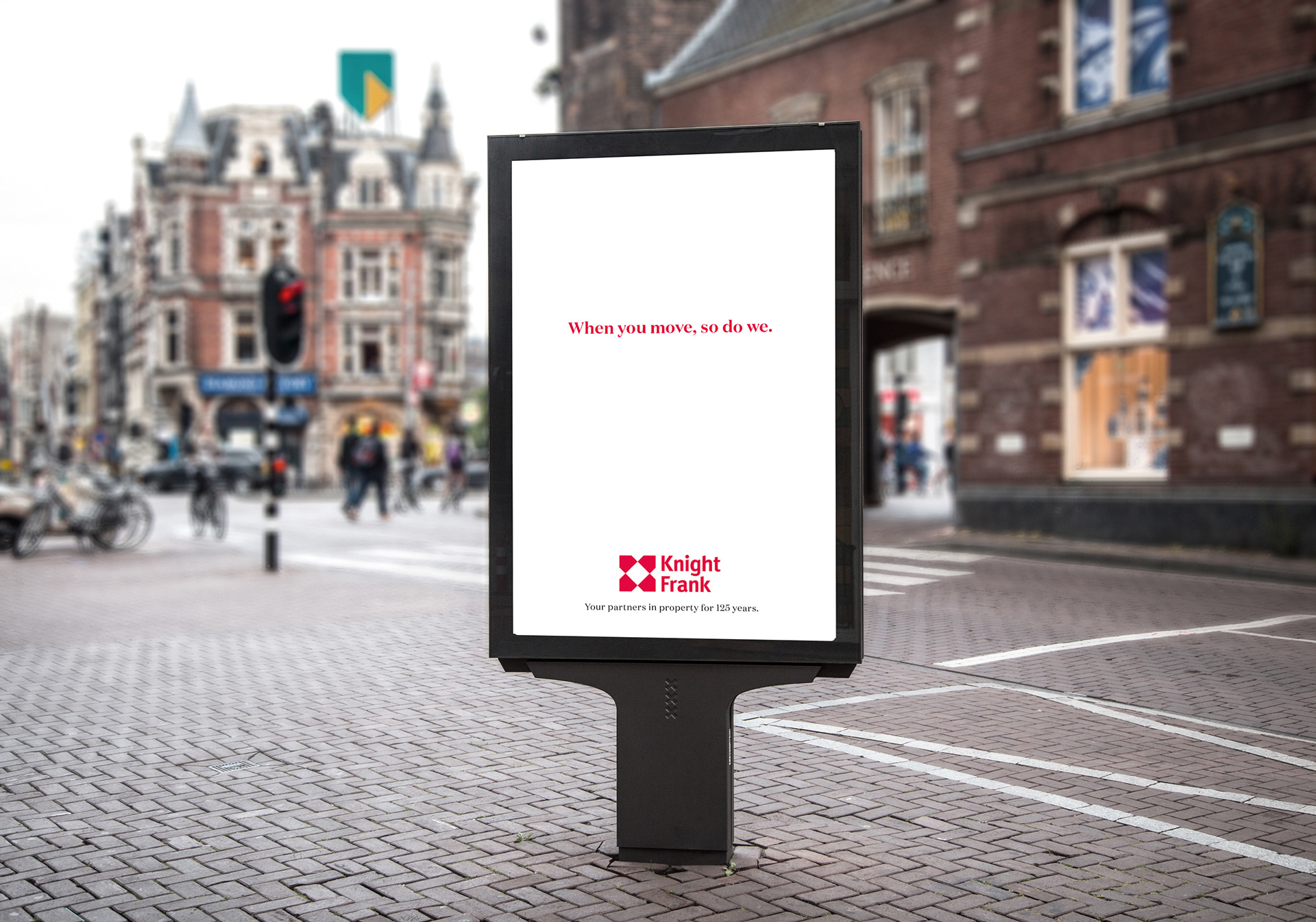
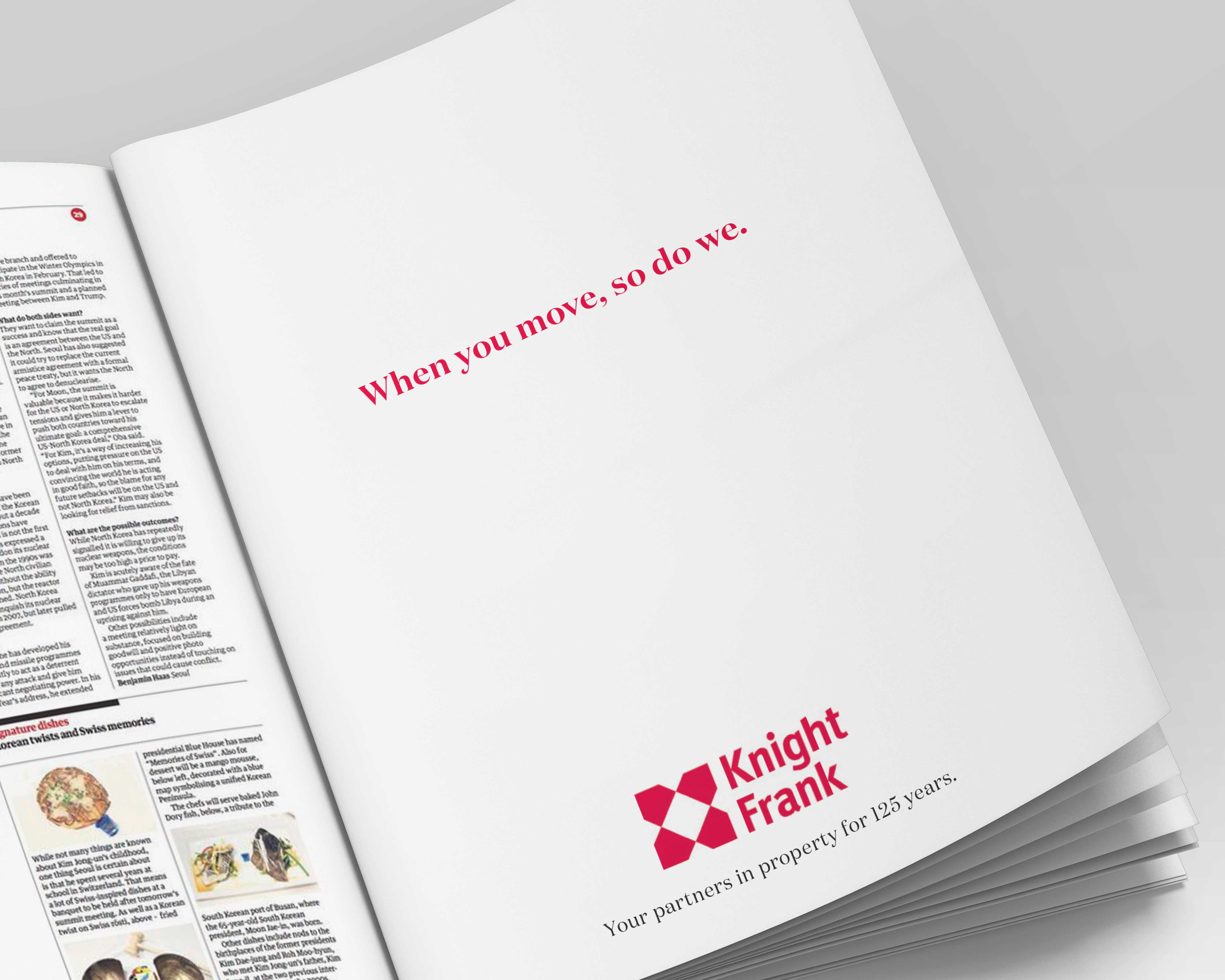
An above the line ad campaign was launched featuring OOH and press ads.

A style guide including all new assets was created to be used by the in-house team.