Age Partnership
Age Partnership have tailored a range of financial solutions specifically for the over 50s, all designed to help current, and soon-to-be, retirees make the most of their finances. The company liked the butterfly icon in their existing logo, but wanted to look at options of how to make the logo, colour palette and fonts more accessible, taking in account the older target audience.
Creative Direction | Positioning | Identity Design

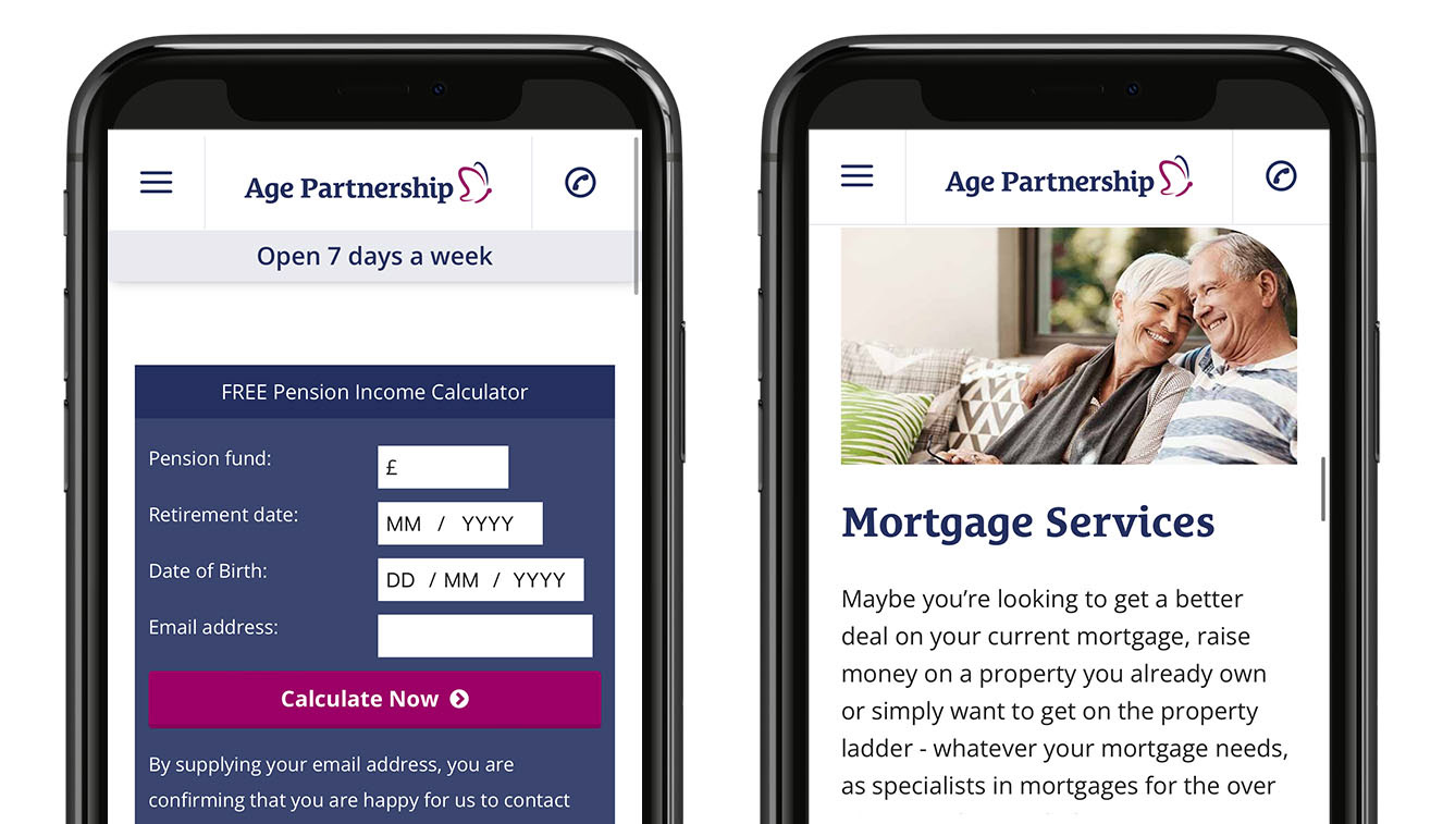
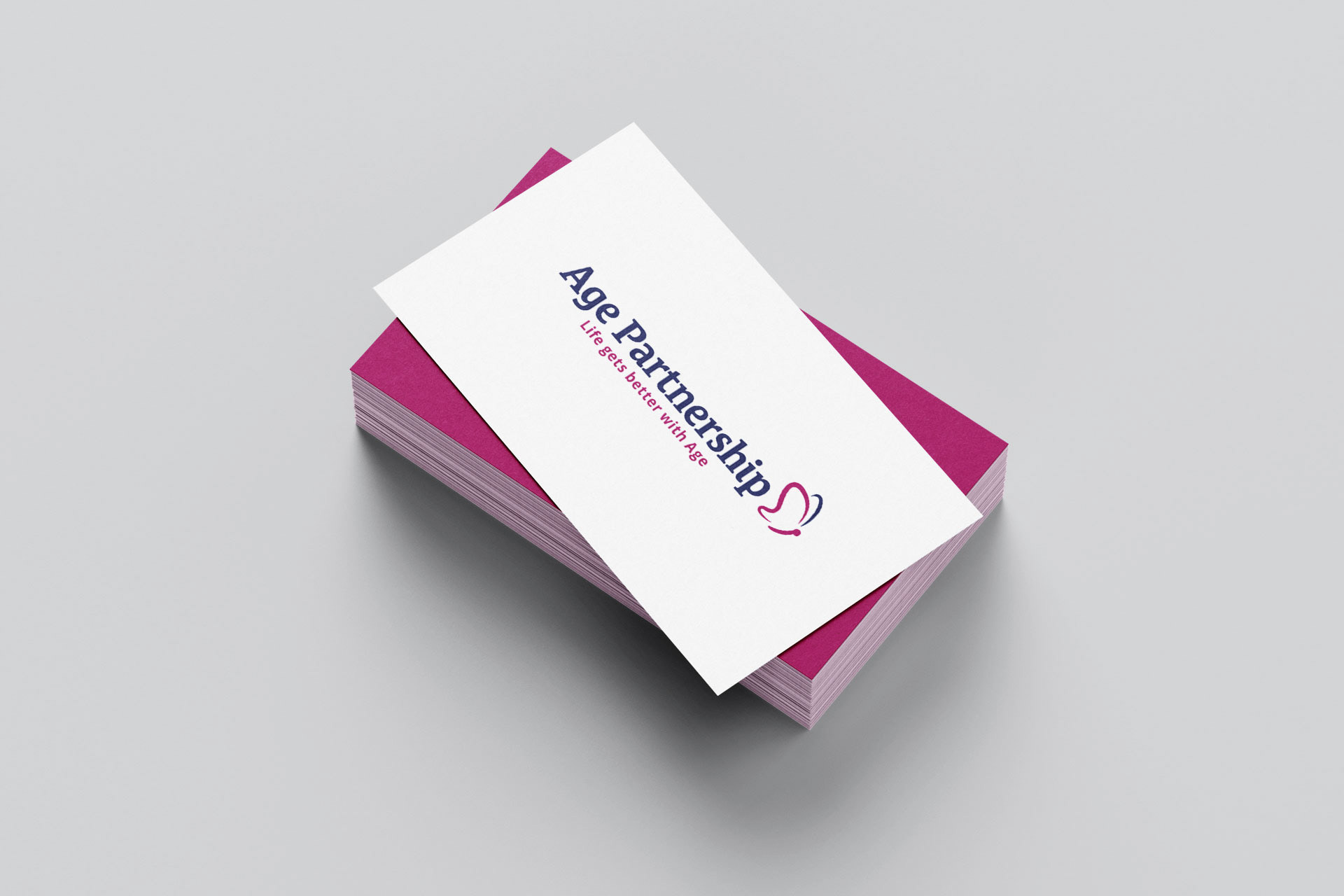
The new icon, colours and fonts are more accessible, especially on mobile.
Several concepts were pitched to the client after the initial meeting, including some new ideas for logos.
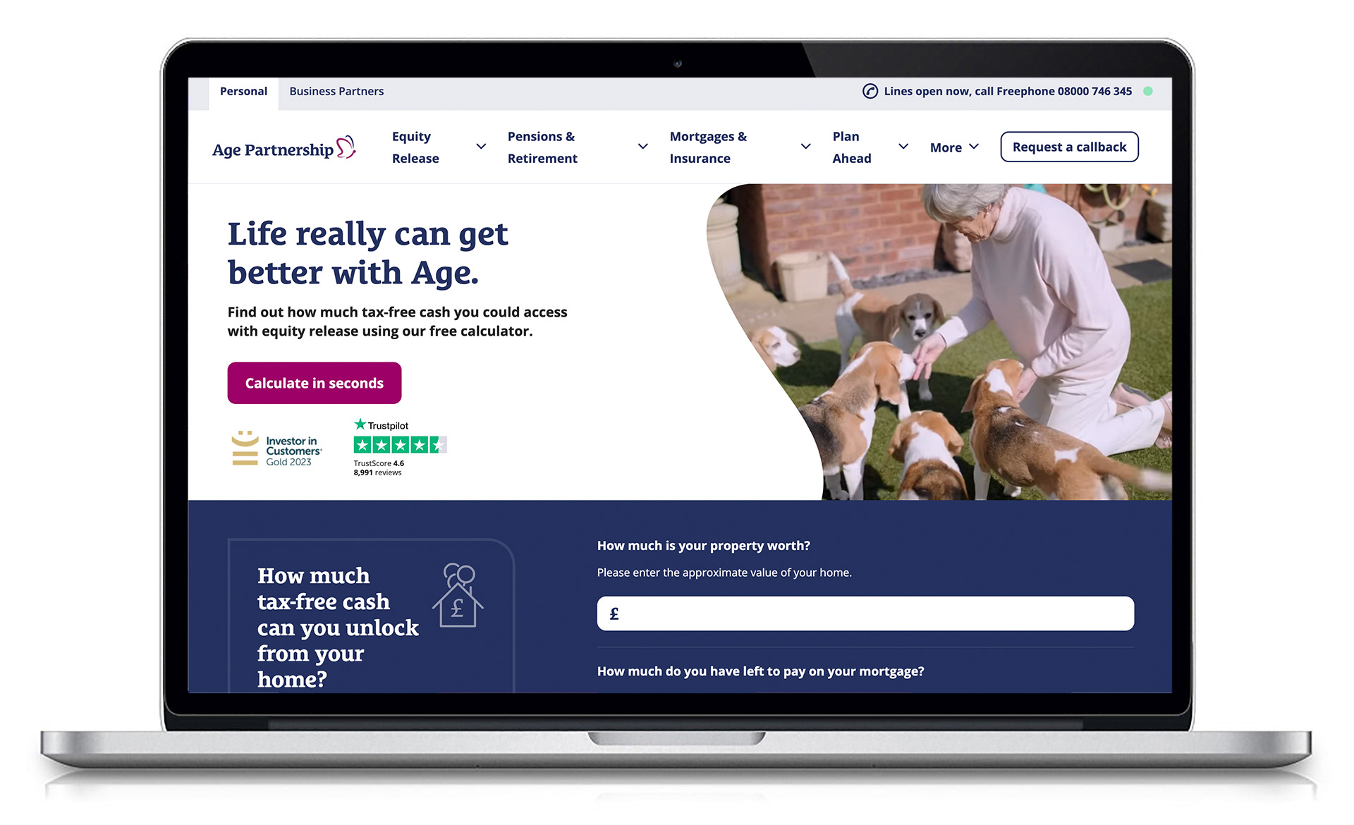
The new identity was then applied to the website design.